Please Scroll Down
Take a look at some of my Recent Projects
Hello and welcome!
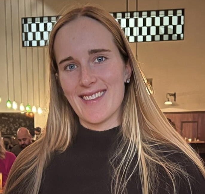
I’m Erin, a data analyst based in San Francisco, California. With a background in web design and extensive experience in office management and the superyacht industry, I recently completed a data analytics bootcamp at UC Berkeley. I am passionate about using data to uncover insights and drive strategic decisions.
-
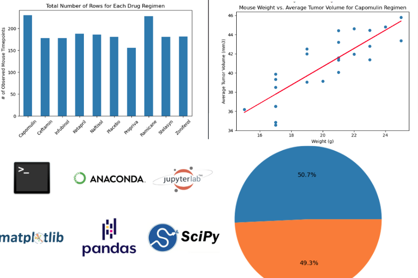
Matplotlib Lab Result Analysis
Here, I utilize data from pharmaceutical study, to reveal trends and insights in cancer treatment effectiveness.
Primary Tools Include
Matplotlib Scipy Stats
-
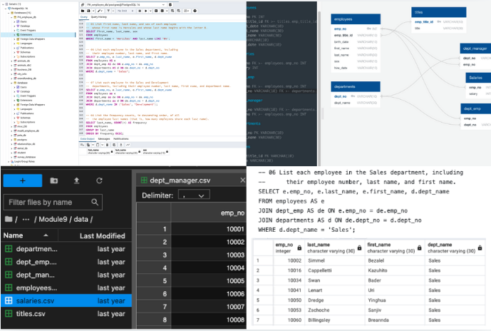
SQL Employee Analysis
Discover my SQL prowess through complex data modeling, engineering, and analysis, as I extract valuable insights from a rich database of employee data.
Primary Tools Include
Postgres pgAdmin
-
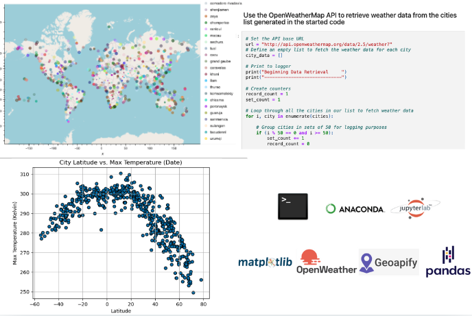
API Vacation Planning Analysis
Plan the perfect vacation using Python and Geoapify API to map ideal weather conditions and nearby hotels, showcasing data integration and geographic visualization skills.
Primary Tools Include
Matplotlib Openweather Api Geoapify
-
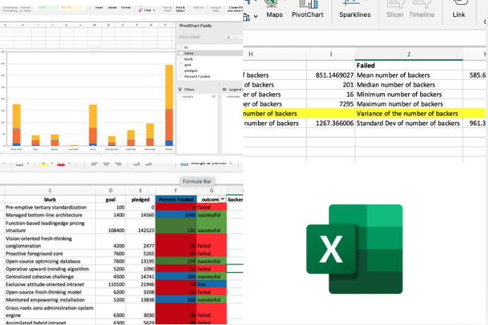
Excel Campaign Data Analysis
Analyze Kickstarter data in Excel to uncover trends and success factors for crowdfunding campaigns, employing pivot tables, charts, and statistical analysis.
Primary Tools Include
Excel
-
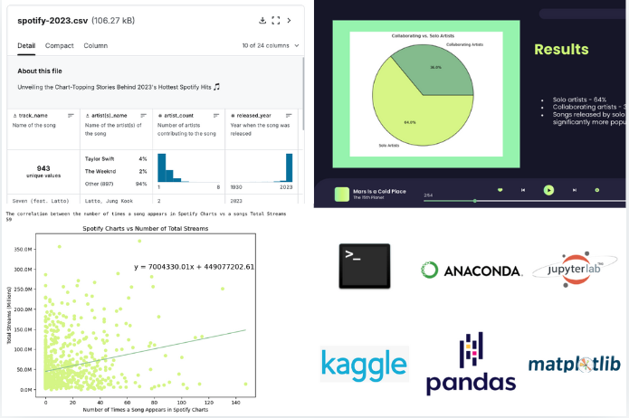
Spotify Artist Performance Analysis
Dive into Spotify data to explore how artist collaborations, release dates, and song attributes impact streaming success, using comprehensive data cleaning and visualization techniques.
Primary Tools Include
Pandas Matplotlib
-
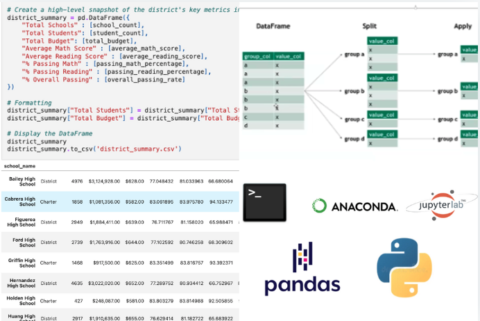
Pandas Standardized Test Data Analysis
Explore the power of data manipulation with Pandas, showcasing my ability to clean, analyze, and visualize diverse datasets to extract meaningful insights.
Primary Tools Include
Pandas
-
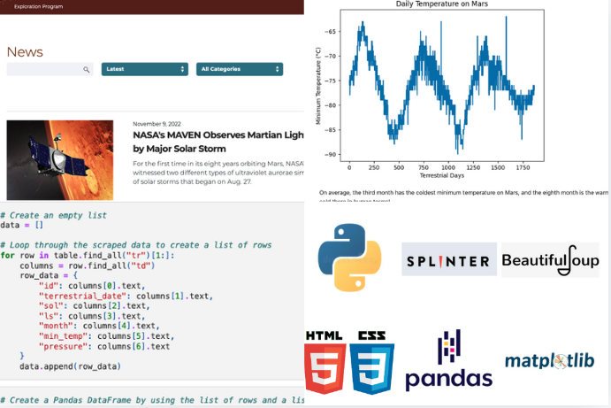
Web Scraping Weather and News Data Analysis
Here I demonstrate my web scraping prowess by extracting and analyzing Mars weather patterns and news data. Utilizing Beautiful Soup and Pandas, this project uncovers Martian weather trends and provides insights beneficial for scientific research and space missions.
Primary Tools Include
HTML/CSS Beautiful Soup
-
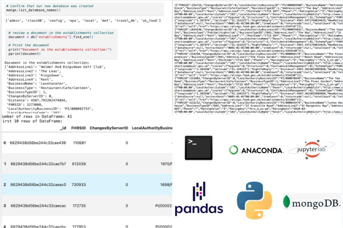
NoSQL Food Establishment Data Analysis
Explore my project on querying MongoDB databases to analyze UK food hygiene ratings. Using PyMongo and Pandas, I identified key insights for "Eat Safe, Love" magazine, focusing on top-rated establishments and areas for improvement. Check it out to see effective NoSQL data analysis in action.
Primary Tools Include
Pandas MongoDB
-
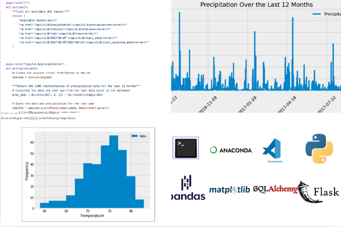
SQLAlchemy Climate Analysis With Flask
Explore my project on analyzing Honolulu's climate using Python and SQLAlchemy, complemented by a Flask API to serve the results. Discover insights into precipitation and temperature patterns, and interact with the data through an API with multiple endpoints. Check it out to see how I integrated data analysis with web development.
Primary Tools Include
SQLAlchemy Flask
-
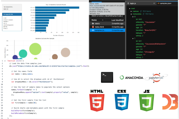
JavaScript - D3 Biodiversity Analysis
Explore microbial biodiversity with this interactive dashboard. Visualize data dynamically with bar and bubble charts, and gain insights into microbial species and demographic information through engaging, user-friendly features.
Primary Tools Include
JavaScript D3 Library
-
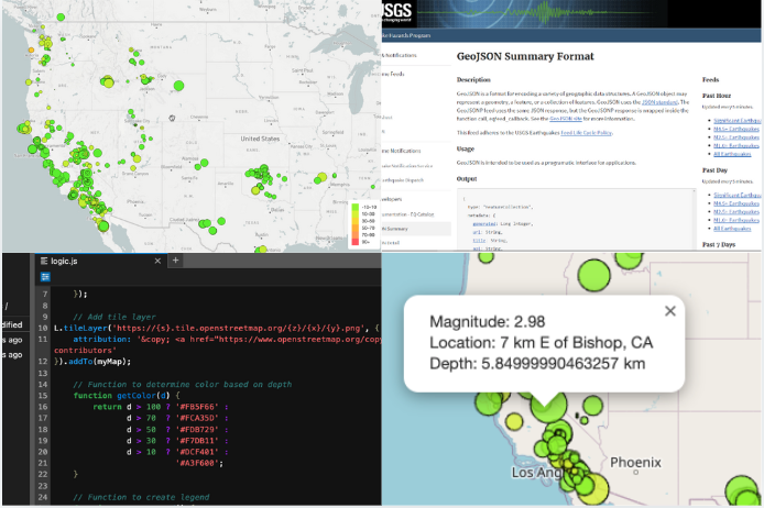
Leaflet - Earthquake Data Visualization
Visualize real-time earthquake data with an interactive map using Leaflet and D3. Explore global earthquake patterns and magnitudes with intuitive markers and popups, enhancing understanding of seismic activities.
Primary Tools Include
D3 Library Leaflet
