Click Here to view the repository
RepositoryMatplotlib Lab Result Analysis
-
Objective
Explore this project where I leverage the Matplotlib library and Jupyter Lab to create insightful visualizations, showcasing skills in data visualization and analytical storytelling while using a lab rat dataset
Method
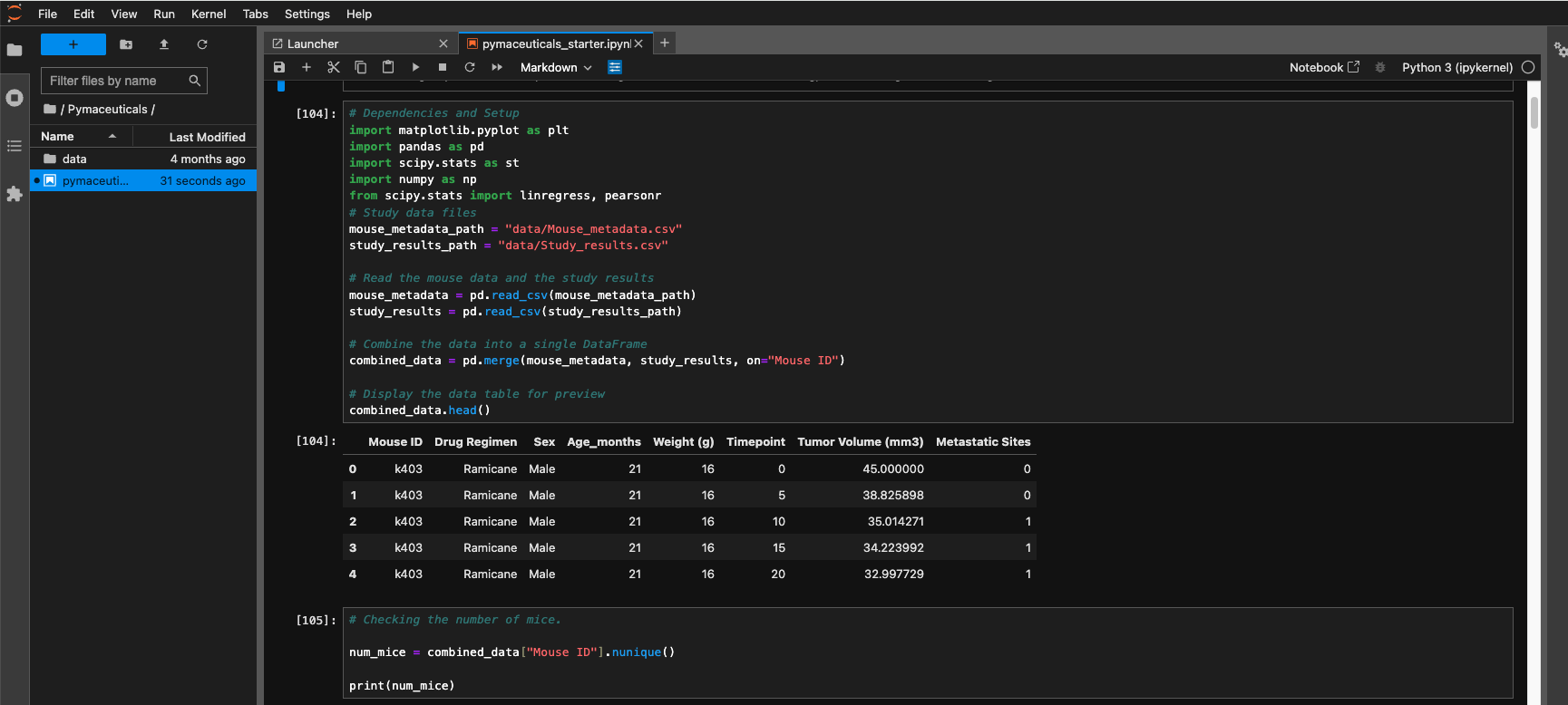
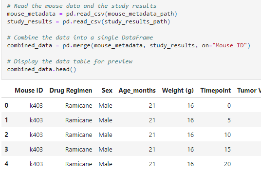
Prepare the Data: Merged DataFrames: Combined mouse_metadata and study_results into a single DataFrame. Checked for Duplicates: Identified and removed duplicate mouse IDs with duplicate time points Displayed Unique Mice IDs: Showed the number of unique mice IDs in both the merged and cleaned DataFrames. Generate Summary Statistics: Calculated mean, median, variance, standard deviation, and SEM of tumor volume for each drug regimen and stored results in a new DataFrame. Create Bar Charts and Pie Charts:
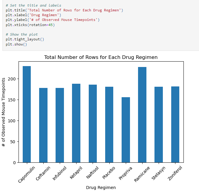
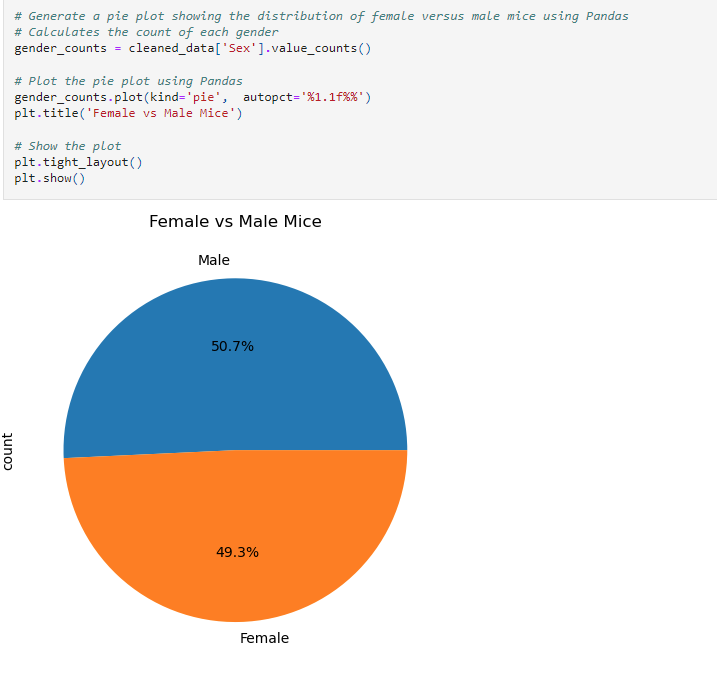
Bar Charts: Generated bar charts using Pandas and Matplotlib to show the total number of timepoints for each drug regimen. Pie Charts: Created pie charts using Pandas and Matplotlib to display the distribution of female versus male mice in the study. Calculate Quartiles, Find Outliers, and Create a Box Plot:
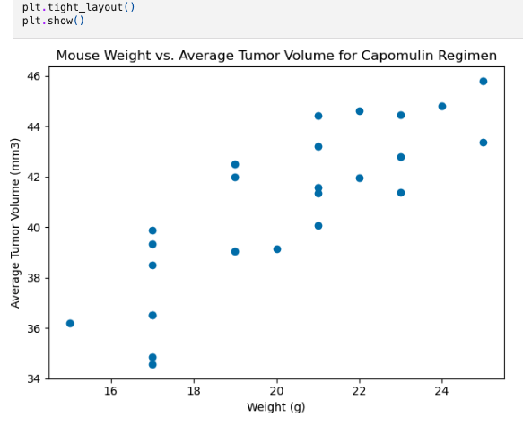
Determined quartiles, interquartile range (IQR), and potential outliers for final tumor volumes across specific treatment regimens. Created a box plot using Matplotlib to visualize the distribution of final tumor volumes, highlighting outliers. Create Line Plot and Scatter Plot: Line Plot: Generated a line plot showing tumor volume over time for a selected mouse treated with Capomulin. Scatter Plot: Created a scatter plot to depict the relationship between mouse weight and average tumor volume for the Capomulin regimen. Calculate Correlation and Regression: Computed correlation coefficient and performed linear regression analysis between mouse weight and average tumor volume for Capomulin-treated mice. Visualized the regression line on the scatter plot.Findings
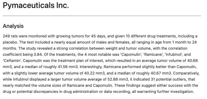
Analyzed and visualized tumor treatment regimens using statistical measures and various plots. Revealed trends and relationships, such as the correlation between mouse weight and tumor volume for the Capomulin regimen.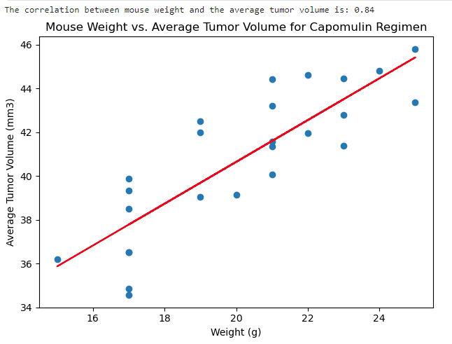
Impact
Demonstrated ability to handle and clean data, perform statistical analysis, and create effective visualizations using matplotlib and Pandas. Highlighted skills in interpreting and communicating study results effectively, beneficial for data-driven decision-making.Challenges
Managing data integrity during merging and cleaning processes. Ensuring accurate calculation of statistical measures and identification of outliers. Creating clear and informative visualizations to effectively communicate complex data insights.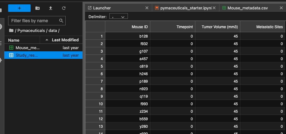
Tools Used
Terminal Jupyter lab Anaconda Matplotlib pandas Scipy stats